Kotak Mutual Funds
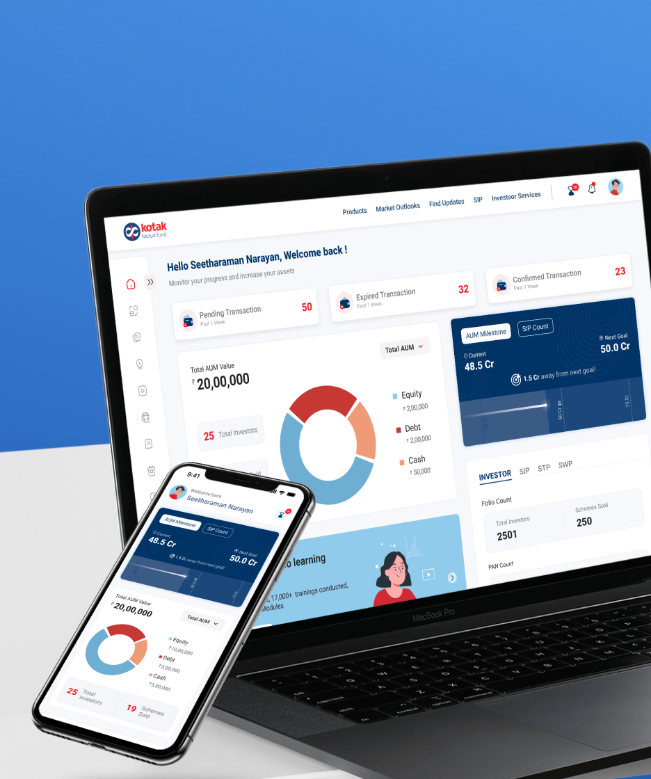
Redesign the Mutual Fund Advisor Portal and create a scalable product

A focused approach to defining and designing icons for unique actions in Innovapptive’s app experience
As part of a redesign project for Innovapptive, I partnered with the design team to create a cohesive icon set for their mobile and website app experience. The project involved understanding the context of required icons, iterating on design options, and delivering finalized icons in a filled style. Additionally, I provided comprehensive design guidelines to ensure consistent implementation across the platform.
Icon Designer
February 2024 (1 mo)
Current app experience
Innovapptive develops software to help businesses operate more efficiently by connecting teams and streamlining processes. However, the app's current icon experience is inconsistent and lacks cohesion, making navigation less intuitive for users. Many icons fail to clearly represent their intended actions or terms, resulting in ambiguity.

To design a cohesive and intuitive icon set for Innovapptive’s mobile and web app that enhances user experience, aligns with the design style, and ensures consistency.
Additionally, to define icon design guidelines for streamlined development and visual harmony.
The short-term project required efficient ideation, iteration, and delivery. Icons needed to align with the app's existing design language, cater to diverse functions, and maintain uniformity, with the focus limited to creating icons and defining guidelines.
Design Process Overview

Grid and Style
The icon design embraces a round, soft-edged style with clean design elements. This approach prioritises simplicity, clarity, and approachability, enhancing user experience across digital platforms. The rounded edges exude warmth and friendliness, while the clean design ensures legibility and coherence.

Stroke Weight
Various options were tested to arrive at the ideal stroke weight, with 1.4 being deemed optimal. This weight strikes a balance, imparting boldness without cluttering the design.

Usage

Icons That Click: The Icon Library

Reflection
This was my first experience designing icons from scratch. I learned how to create design guidelines and use the pen tool effectively, which helped me enhance my skills and be pixel perfect.
This project taught me the importance of creating icons that simplify complex terms and convey context clearly. A good icon should be intuitive and purposeful, helping users understand actions or concepts at a glance without confusion.
 You made it till the end of the case-study!
More Projects